
Yeah, maybe later something real hot. This rather cool like a good bye to the winter.  I was thinking of a bordeaux red with some pacific vibrant yellow... or something
I was thinking of a bordeaux red with some pacific vibrant yellow... or something I see what you doin' there

Ok, here it is - 2 versions. A clean one or with bodykit parts and shadows from daloonies kit.
If you want something changed, feel free to say so.
Jaz
Nice! But the stripes on the front don't go along over all, IMHO. Maybe it should be like the rear or more thicker like on the sides.

Thx for the feedback !
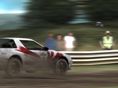
The intention was indeed a static cam like a journalist covering the top story of the LRC. (even the devs were there
)I never noticed the blur differences. As this was a static cam, i would have had to use more FOV too then, no? I barely look at photographs that close... just enjoyed the cars, but will definitely have an eye on that.
I guess you're right about the dust too. I was on it for 1-2h and probably gone a bit overboard. The first layers looked quite nice and i probably should have stopped there. Recoloring it, it would work as smoke pretty good i guess. With a bit of distance now, the biggest problem for me in the end is, that it's missing a bit detail like rocks and stuff. (wich is a lot easier said than done
)Thx for the votes. When i saw all the real pic edits, i knew the screenshots would have a hard time and are unlikely to win.
As the idea of this competition for me is the editing of screenhots i am gonna vote for either macsy or JOS3PHS, but not sure yet.
The light blue shine might be a bit off (i give you that
), but the base is good, no?Inouva, it was posted a page back ^^
Migz, i dont get it...
Edit: Ah "do one" guess that's it, Thx Chupacabras. I wouldn't think of this stuff when i'm with my mom.
LoL
Migz, i dont get it...
Edit: Ah "do one" guess that's it, Thx Chupacabras. I wouldn't think of this stuff when i'm with my mom.
LoL
Last edited by JazzOn, .
This should be relatively easy
If you have a bit time, i could get on it tomorrow or the next days.
Do you want logos decals or some writing on it?
E: like this?
If you have a bit time, i could get on it tomorrow or the next days.
Do you want logos decals or some writing on it?
E: like this?
Last edited by JazzOn, .
I think during your production something gone wrong. Maybe you were distracted... or your logo was faulty (recently a logopack was released but turned out that the images were not original in their propotions)
Do it again, because like you said, GAVD999 showed it pretty much unmistakeable and proven that the value is correct.
Last edited by JazzOn, .
Reason : wrote Dav instead of Gav ...
@ Kristis917, I really have a hard time following you
Yes, looks quite accurate, although an overlay would point out if there is a difference.
Of course they are not, because you resized them.
I don't understand...
You squeezed the logo on the skin to 65% and it appears on the skin how it should be... so... 65% is correct.
Edit: wow, how long was i writing xD.... didnt see your post Gav... Spot on ^^
Edit PS: I've added your example in the thread. It's nicely done and good to understand. It might help one or the other to understand the problem.
Last edited by JazzOn, .
incorrect
Are your eyes your only measurement or do have a valid argument ?
Maybe you should let your eyes get checked, dude... or stop trollin'
Yeah, sometime one is too focused on other things. Happens to me very (very) often  Glad the guide helps, but remember that you need to adjust a bit manually when doing cars like FZ or RB were the bodyshape is round. Tho' i guess you've read the whole thread and you are aware.. just sayin'
Keep it up. Good Work
Glad the guide helps, but remember that you need to adjust a bit manually when doing cars like FZ or RB were the bodyshape is round. Tho' i guess you've read the whole thread and you are aware.. just sayin' Keep it up. Good Work
Hi, Gav
2 cents
I think the grey on the roof could be a bit darker.. looks a bit out of contrast
2 cents
I think the grey on the roof could be a bit darker.. looks a bit out of contrast
Awesomes.s.s
New Wave? I guess i didn't understand the concept
nice stuff
New Wave? I guess i didn't understand the concept
nice stuff
Hmm odd but it's no problem. http://www.lfsforum.net/showthread.php?t=64155
heh, new gear needs his time to become comfortable, but you sorted it
Gratz on the points and Good Luck for the future
Gratz on the points and Good Luck for the future
So you don't like it ?
I actually regret putting the pro circuit and lfs logo on it. As another matter of fact, this and the 'over-exposed Victor' are things i consider a mistake in my edit. I'd never released this skin with additions or edits (including removing your name from it) and claim as my own. And 1 thing you can be sure of, I'd put as much dedication and attention to detail in it as if it were my own... If...
BTW Guys, C&C are always welcome
Oh yeah sure mate. As a matter of fact only for the photoshooting
As a indemnity for damages, i'll send you the 'dirt' layer (when i ever finish it) How does that sound?
Final Entry
Last edited by JazzOn, .
Reason : slight correction...

Jesus, this will be great... Reeeleeaaaase finally FFS
Love the afternoon overcast on SO shot, but not so much on the london experiment. I think it looks too much like it's now!?
Anyways, i'm sure it will be great.
Love the afternoon overcast on SO shot, but not so much on the london experiment. I think it looks too much like it's now!?
Anyways, i'm sure it will be great.
I for one think the idea is nice. The light just looks 'too small/short' if you know what i mean. Standing that close to the lights there would be barely anything else to recognise, me thinks.
@Xaid0n, E: ahhh nvm
@blake I got like 14 screens of that scene. It looks abit like a new track, no? A section that looks so blant when driving there. I also want to add some spectators... someone got the pic of the devs lying around?
@blake
I got like 14 screens of that scene. It looks abit like a new track, no? A section that looks so blant when driving there. I also want to add some spectators... someone got the pic of the devs lying around?
Last edited by JazzOn, .
aight .. fine.. will never do it again
knock yourself out
Cheers, Z!
knock yourself out
Cheers, Z!
FGED GREDG RDFGDR GSFDG